
Most A+ Content on Amazon looks the same. Same lifestyle photo, same three-icon comparison chart, same generic “why choose us” section that says nothing specific. We see this pattern across almost every account we audit, and it usually means the brand is leaving conversion rate on the table.
This case study breaks down how we rebuilt A+ Content for a home and kitchen brand ahead of a major product launch, and how that rebuild contributed to $567K in revenue within the first five months post-launch. We’re not naming the brand, but every number here comes from the account’s actual Amazon Brand Analytics and Seller Central reporting.
The starting point: a strong product with weak storytelling
The brand had a genuinely good product. It solved a real problem in a crowded kitchen category, the manufacturing quality was solid, and early reviews from a small test batch were positive. The problem was that none of this came through in the listing.
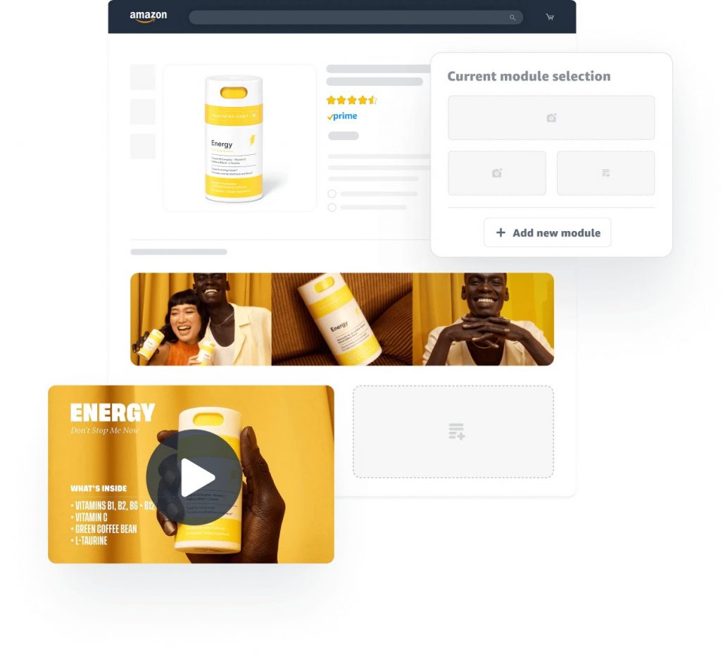
The original A+ Content draft (built in-house before they came to us) had three modules: a hero banner, a single feature comparison chart, and a generic brand story block copied almost word for word from a template. Conversion rate on paid traffic sat at 8.2%, which is below category average for a product at this price point.
We see this exact pattern constantly. Sellers spend weeks on product research and sourcing, then treat the listing as an afterthought, something to “fill in” before launch. A+ Content gets built last, under time pressure, with whatever stock photography the supplier provided. The result is a listing that looks professional at a glance but does nothing to answer the buyer’s real objections.
Rebuilding the A+ Content around actual buyer objections
Before touching design, we pulled every piece of customer feedback available: the brand’s own beta tester notes, competitor reviews in the same category (both 5-star and 1-star), and search term reports from the category’s top ASINs. This told us what buyers were actually worried about before purchase.
Three objections came up repeatedly:
- Whether the product would actually fit their kitchen storage (a common pain point in this category)
- Durability concerns, since a competing product in the space had a reputation for cracking after a few months of use
- Uncertainty about care and cleaning instructions, which buyers said they couldn’t find clearly on competing listings
We rebuilt the A+ Content specifically to answer these three points, in this order, using comparison modules, close-up texture shots, and a dedicated care instructions module with icons instead of dense paragraph text. Nothing in the new content was generic. Every module existed to remove a specific reason not to buy.
We also added a founder-story module, but kept it short and specific: three sentences about why the product was designed the way it was, tied directly to the durability objection. Long brand stories that talk about “passion for quality” tend to get skipped. Specific stories that answer a real question get read.
The launch numbers
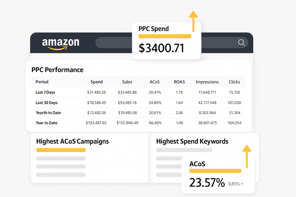
The new A+ Content went live two weeks before the official launch date, alongside updated main images and a revised bullet point structure that mirrored the same objection-first logic. Over the following five months:
- Conversion rate moved from 8.2% to 14.6% on comparable PPC traffic
- Total revenue for the period reached $567K
- ACOS on the primary launch campaign dropped from an early 38% to a stabilized 19% as conversion improved and the algorithm rewarded the listing with organic placement
- Return rate for the “doesn’t fit as expected” reason code dropped by more than half compared to the brand’s previous product in the same line
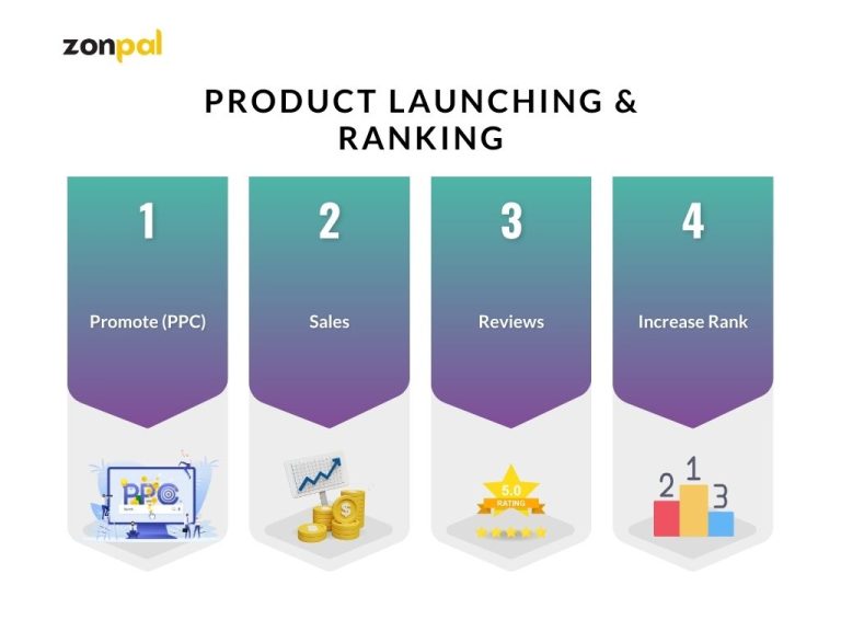
The most important number here isn’t the revenue total, it’s the conversion rate lift. Nearly doubling conversion rate on the same traffic and the same ad spend is the difference between a launch that barely breaks even on PPC and one that funds its own growth. We’ve covered this dynamic in more detail in our guide to structuring a PPC launch budget, since content and ad strategy have to work together, not in isolation.
Why this matters if you’re evaluating an agency
If you’re reading this because you’re comparing agencies for your own launch, the specific numbers matter less than the process behind them. A lot of agencies will show you a portfolio of polished A+ Content and call it a win. Polish is not the same as strategy.
Here’s a short checklist we’d recommend using when you’re evaluating who builds your listing content:
- Do they ask about buyer objections before designing anything? If the first conversation jumps straight to visual style, that’s a red flag.
- Do they pull competitor review data as part of the process? This is where the real objections live, not in a creative brief.
- Can they explain why each module exists? Every module in a good A+ Content build should map to a specific reason a buyer hesitates.
- Do they track conversion rate before and after, not just “looks better” feedback? If an agency can’t show you a before/after conversion number from a past client, ask why.
- Is content planned alongside PPC and pricing, or built in isolation? A+ Content that isn’t coordinated with your launch ad strategy tends to underperform even when the design is strong.
We’d recommend asking any agency you’re evaluating to walk through one real launch, start to finish, the way we just did here. If they can’t point to a specific objection they solved with a specific module, that’s usually a sign the content was built on instinct rather than data.
How to apply this to your own account
You don’t need an agency to start applying this logic today. Pull your own negative reviews and your top three competitors’ reviews. Sort them by theme. You’ll likely find two or three objections that show up again and again, the same way we found fit, durability, and care instructions in this case.
Once you have those objections mapped, audit your current A+ Content module by module. For each module, ask: does this answer one of the objections on my list? If a module doesn’t answer anything specific, it’s dead weight. Replace it.
This is also a good moment to revisit your bullet points and main image, since they should reinforce the same objections rather than repeating generic claims. We go deeper into this in our listing optimization guide, which covers how to structure bullets around buyer intent rather than keyword stuffing.
Final thoughts
The $567K result in this case study didn’t come from better design software or more expensive photography. It came from treating A+ Content as a conversion tool built around specific buyer objections, not a branding exercise built around aesthetics.
If you’re weighing whether to bring in outside help for your next launch, it’s worth looking at how other brands have approached this same problem in practice. You can see more real launch breakdowns like this one in our case studies section, where we walk through the strategy and numbers behind other Amazon launches we’ve managed.