

If you sell in the Home & Kitchen category, you already know the visual bar is high. Shoppers scroll past a dozen near-identical cutting boards, dish racks, or storage bins before they stop on one. A+ Content is often the difference between “looks fine” and “looks like a brand worth trusting in my kitchen.”
The problem is most sellers treat A+ Content as an afterthought: a few stock photos, a bullet list restated in image form, done. That’s a missed opportunity. In a category where buyers are picturing your product on their counter or in their cabinet, A+ Content should do real selling work.
This guide walks through specific A+ Content module ideas built for Home & Kitchen listings, with practical direction on what to show, what to avoid, and how to sequence modules so they actually move conversion.
What you need before you start
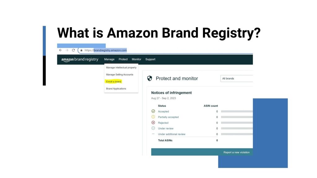
Before you touch a single module, confirm you’re actually eligible. A+ Content requires Amazon Brand Registry, so if your brand isn’t enrolled yet, that’s step zero. Enrollment usually takes a few days once you have a registered trademark, so plan ahead if you’re launching a new listing.
You’ll also need a few production basics in place:
- Real product photography, not just the images already on your listing. A+ modules often need different aspect ratios and closer detail shots than your main gallery.
- A clear brand story angle. Even a simple one, like “we design for small kitchens” or “founded by two home cooks,” gives your modules a point of view instead of generic claims.
- Comparison data if you sell multiple SKUs (sizes, colors, bundle counts). You’ll want this ready for a comparison chart module.
- Specs and care instructions written out clearly. Home & Kitchen buyers ask a lot of “is this dishwasher safe” and “what’s the actual capacity” questions, and A+ Content is where you answer them before they become a return.
If you’re still building out your core listing (title, bullets, backend keywords) before layering A+ Content on top, our Amazon listing optimization guide covers that groundwork in more depth.
Step 1: Open with a lifestyle hero module, not a spec sheet
Your first A+ module is prime real estate. Most Home & Kitchen sellers waste it on a flat product shot that repeats what’s already in the main image gallery. Instead, open with a lifestyle module that shows the product doing its job in a real kitchen setting.
For example, if you sell a knife block set, don’t open with the block sitting on a white background. Show it on a countertop next to a cutting board mid-prep, with natural light and a lived-in feel. If you sell a food storage system, show a fridge shelf actually organized with your containers, labeled and stacked.
The goal is to let the shopper project the product into their own home in under two seconds. A generic “Premium Quality” banner headline does none of that work. Use a short, specific headline instead, something like “Built for Everyday Meal Prep” or “Fits Standard Fridge Shelves,” and let the image carry the emotional weight.
Step 2: Use a comparison chart if you sell more than one SKU
If your brand offers multiple sizes, colors, or bundle options, a comparison chart module is one of the highest-leverage things you can add. Home & Kitchen shoppers frequently hesitate between variations: 2-quart vs. 4-quart, set of 4 vs. set of 8, stainless vs. non-stick.
A well-built comparison chart removes that friction directly on the page instead of forcing the buyer to open multiple tabs. Include the essentials: dimensions, capacity, material, dishwasher safety, and price tier if relevant. Keep the row labels in plain language, not internal SKU codes.
We’ve seen accounts where adding a comparison module to a multi-variation kitchenware listing reduced pre-purchase questions and returns tied to “wrong size ordered,” simply because the decision got easier to make on the page itself.
One practical tip: link this chart module to your other ASINs where relevant, so a shopper looking at the small size can see (and click into) the larger one without leaving your brand’s ecosystem.
Step 3: Zoom in on material and build quality
Kitchen products live or die on perceived durability. A cutting board that looks flimsy in photos will get scrolled past even if the actual product is solid. Dedicate at least one module to close-up, texture-level shots: the grain of a wood board, the weld point on a metal rack, the seal on a storage lid.
Pair each close-up with a short, specific claim, not a vague one. “Built to last” tells the shopper nothing. “Reinforced stitching at the handle seam” or “Food-grade silicone gasket for a leak-proof seal” tells them exactly what they’re paying for.
If your product has a genuine material advantage, bamboo instead of plastic, BPA-free construction, magnetic base for easy storage, this is the module where you prove it visually instead of just claiming it in a bullet point.
Step 4: Add a “how it works” or usage instruction module
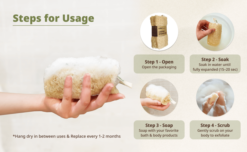
A surprising number of Home & Kitchen returns come from shoppers not understanding how to use or assemble a product before it arrives. If your item requires any setup, has multiple functions, or has a non-obvious feature, build a step-by-step visual module for it.
Think of a collapsible dish rack that folds three different ways, or a multi-compartment lunch container with a specific lid-locking mechanism. Break the usage into 3 to 5 numbered visual steps with short captions. This is also a good place to address common confusion points that show up in your review section, if customers keep asking “how do I clean the filter,” put the answer directly in this module.
This kind of module doesn’t just help conversion, it tends to reduce post-purchase support tickets and negative reviews tied to confusion rather than actual product defects.
Step 5: Handle objections with a specs or FAQ module
Every Home & Kitchen category has a handful of recurring hesitations. Is it dishwasher safe? Does it fit a standard oven? Is it actually the size shown in photos? Rather than letting these questions go unanswered until a shopper reads through 200 reviews, address them directly in an A+ module.
A clean FAQ-style module with 4 to 6 short question-and-answer pairs works well here. Keep answers factual and specific:
- “Is this microwave safe?” Yes, up to 450°F.
- “Will this fit a standard 24-inch cabinet?” Dimensions are 22.5″ W x 14″ D.
- “Is the lid included?” Yes, one matching lid is included with every unit.
Pull these questions directly from your existing customer Q&A section and review text. If shoppers are already asking, that’s your evidence for what belongs in this module, no guesswork required.
Step 6: Close with a brand story module

Save your brand story for the end of the A+ sequence, not the beginning. By the time a shopper reaches this module, they’ve already seen the product work in a real setting, understood the sizing, and had their objections addressed. Now you’re building the final layer of trust: why should they buy from this brand specifically.
Keep it short and specific rather than generic. Avoid lines like “we are passionate about quality” that could apply to literally any seller. Instead, anchor it in something concrete: a founding story, a manufacturing detail, a specific problem you set out to solve in someone’s kitchen.
If you sell across multiple related products, this module is also a natural place to cross-sell. A “Complete Your Kitchen” comparison row with 3 to 4 other ASINs from your catalog can lift basket size without feeling like an upsell.
Common mistakes (and how to avoid them)
We review a lot of Home & Kitchen A+ Content during account audits, and the same handful of issues show up repeatedly:
- Repeating the main image gallery. If your A+ modules show the exact same shots already in your gallery, you’re wasting the space. Every module should add new visual information.
- Text-heavy modules with tiny fonts. Most shoppers browse on mobile. If your headline or body text shrinks to a size that’s hard to read on a phone screen, it won’t get read at all.
- No clear sequence. Modules should build a case, lifestyle first, then proof, then objections, then brand. Randomly ordered modules feel disjointed and lose momentum.
- Ignoring mobile preview. Always check how your modules render on mobile before publishing. A comparison chart that looks clean on desktop can turn into an unreadable mess on a phone.
- Generic claims with no visual backup. “Premium materials,” “built to last,” “trusted by thousands” mean nothing without a specific image or data point behind them.
For a deeper look at how listing elements beyond A+ Content affect conversion, our team also covers image sequencing and keyword placement in the listing optimization guide mentioned earlier.
Wrapping up
A+ Content in Home & Kitchen isn’t decoration, it’s a second sales page that either answers a shopper’s questions or leaves them to guess. The sellers who treat it that way, with a real sequence of lifestyle proof, comparison data, material close-ups, and honest brand story, consistently see stronger conversion than those who fill modules with stock templates.
If you’d rather have a team build and test this sequence for your catalog instead of piecing it together module by module, the Zonpal team handles A+ Content as part of our listing creation and optimization service, from module strategy through final design and upload.